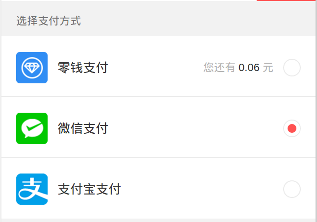
原生单选框的样式实在太丑,UI肯定是不会用的啦,他们一般都会重新设计一种单选框,比如下面这种
设计原理
使用span模拟一个大圆,再利用::before伪类画一个小圆,实际上是一样大的圆,只是小圆的边框很大,占据一定的位置
1 | # HTML |
1 | span{ |
扩展demo
1
2
3
4
5
6
7
8
9
10
11
12
13
14
15
16
17
18
19
20
21
22
23
24input[type=radio] { //原始input-radio保留但隐藏
position: absolute;
visibility: hidden;
}
input[type=radio] + .replace-input { //input的兄弟接待 假span
display: inline-block;
width: r(36);
height: r(36);
border: $border-width solid $color-divider;
border-radius: 50%;
}
input[type=radio]:checked + .replace-input { //被选中的情况下的兄弟节点 假span 的before伪类
&:before {
display: block;
content: "";
width: 100%;
height: 100%;
background-color: $red;
border-radius: 50%;
border: r(7) solid $white;
}
}